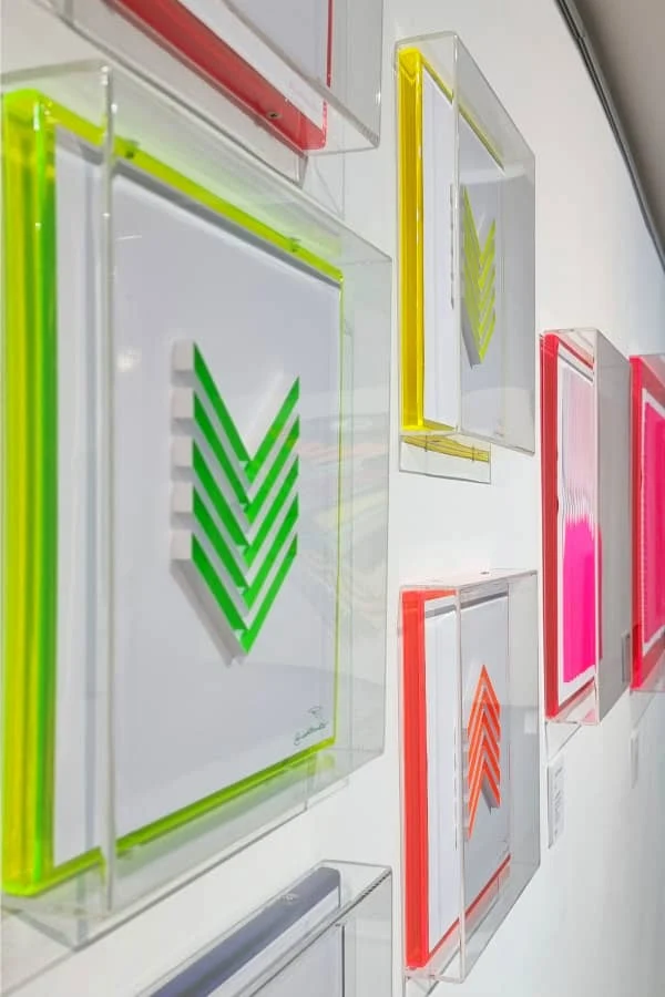
Today we're traveling to East London where we'll get to know urban paper artist Caro Clarke of INKTERAKTIV. She and I met via Instagram where I was immediately taken with her on-edge sculptures, murals and installations for which she often utilizes vibrant fluorescent paper.
I asked Caro to describe her art:
My work emphasizes the
delicacy of paper versus its architectural
structure within a minimalist setting. I draw inspiration for my pieces
from the urban landscape and my travels, as well as a love of neon lighting, typography, architecture, and geometric patterns.

How long have you been interested in paper as your primary medium?
I
was born
in Paris and raised all over the world so creativity and art were my
constants growing up. Paper became the most common and easily
accessible material from an early age.
At
university, it
initially seemed that I was leaning towards a career path
dealing with paper making, book binding, printing techniques, and
packaging. However, a programming and animation course changed all of
that and the digital commercial world took over for about twenty years.

What brought you back to making art in a physical sense?
After
a serious medical ordeal that resulted in my being hospitalized for six months followed
by years of physical rehab, I had to rethink where I was in my
career in my early 40s.
I
remember sitting in my therapist's office talking about how lost I was
and how I felt no attachment or meaning to what I used to do as a
Creative Director. I didn't want to sit in front of a screen anymore. I
didn't want to work for other people. My therapist
reminded me that I was a very creative person and that a creative
outlet was a healthy way to deal with trauma and anxiety.
I went home that night and started looking through my portfolio. I came
across the work I did when I was studying fine art... a lot of it focused
on making my own paper and illustrating and doing traditional Japanese
paper cuts. I had completely forgotten this love of paper. It was like a
light bulb went off! And so I began exploring it again. This was 2016.
Between
developing a new voice with paper, trying new techniques, and
learning about the craft of paper, I started spending more and more time
in my studio. I joined collectives, did group shows and began putting
my paper art out there a bit more. In January 2020 I went full-time as an
artist and also took a small course in paper quilling. And that's when
everything just clicked.
Though I appreciate the traditional paper
quilling techniques, I began cutting my own paper strips, choosing a more
structured paper weight and seeing how far I could go sculpturally. Three years on, and between a pandemic and numerous medical issues, I am still doing what I think I was always meant to do.
Paper
is a natural material that speaks to me in ways no other creative
medium ever has. I feel honoured combining my ideas with such a powerful
entity. With my work, I am trying to express the
contradiction between the natural organic world and the more structured
urban scenes I have always found myself attracted to. And who doesn't
like a bit of fluorescence in their daily life?
Do you recall your first piece that was inspired by this new-found quilling technique?
Quilling my Interaktiv logo was probably the first project I worked on that helped me establish my signature style.
Tell us about your favorite supplies.
GF Smith has some of the best paper out there and I love to start my day in the studio flipping through the company's many color choices... this gets me in the right mindset and gives me ideas for future projects. 270gsm is my favourite paper weight.
I use PVA glue and I
prefer a scalpel over scissors because as a lefty, it's tricky to find a
comfortable pair. For the most part I use Swann Morton #11.
When it comes time to frame a piece, I like Perspex acrylic boxes. (See Caro's framing process on Instagram.)
And your process?
I start with a few drawings and play with colours in my sketchbook. I refine the work in Affinity Designer or Illustrator on the iPad.
One of my reasons for leaving commercial design behind was to spend less
time in front of screens so I try to limit this part of the process
when possible.
I then print a template for my desired size and start playing. What is nice about
having a digital version of the final piece is I can make mistakes and
carry on. I spend a considerable amount
of time on the final piece. This is
where my perfectionist gene tends to take over. The framing
process is just as exciting as it's that final reward to see the project
come together.

When is your next show?
I'll also have work at TheOtherArtFair presented by Saatchi Art in Los Angeles at the end of March.
Fun fact?
My fluorescent art glows in the dark with a black light!

Caro Clarke of INKTERAKTIV
Keep up to date with Caro's latest projects, classes, and shows via Instagram.


