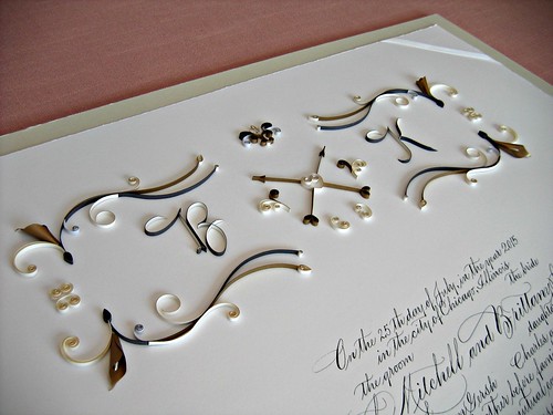
Custom Quilled Ketubah - Monogram
It's truly been All Things Wedding around this blog and my house this summer as our oldest son was married over the weekend. It was so much fun, but more about that another time... today I have another recently married couple's ketubah to show you.
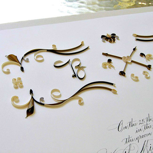
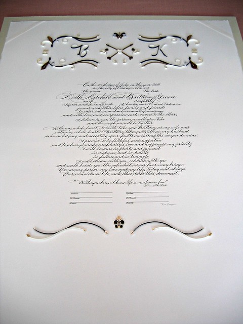
They chose a monogram design I had done previously, but because the bride was carrying calla lilies, she asked me to include them. I placed a metallic gold lily at each corner and also expanded the width of the entire design across the top of the document as it had quite a bit more open space than the earlier certificate.
The wedding colors were gold and ivory, but because the ketubah will hang in a gray room, the bride asked that silver and gray be incorporated too. I must admit I wasn't too sure about mixing gold and silver along with dark and light gray, but I had no sooner begun when I realized I loved the look.... which just proves the importance of keeping an open mind. My favorite descriptive of this color palette would have to be handsome.
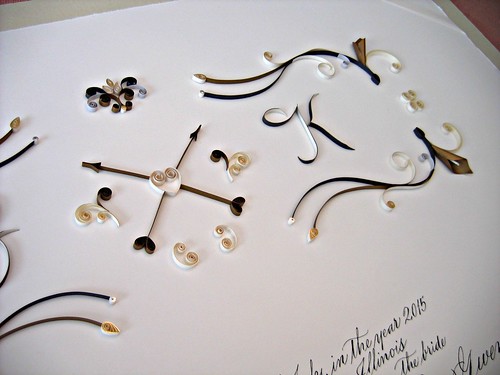
It's difficult to see the metallic edge papers in the photos, but trust me, they look very pretty in person as does the pearlized gold paper used for the arrows and a few other elements.
To shape the initials, I referred to the lettering style of their names on the back of the envelope that arrived with their deposit, so that worked out well!
Once again I collaborated with Riva Brown of Wilmington, Delaware who did her usual impeccable calligraphy. Riva also handles the mounting and shipping of our documents.
They chose a monogram design I had done previously, but because the bride was carrying calla lilies, she asked me to include them. I placed a metallic gold lily at each corner and also expanded the width of the entire design across the top of the document as it had quite a bit more open space than the earlier certificate.
The wedding colors were gold and ivory, but because the ketubah will hang in a gray room, the bride asked that silver and gray be incorporated too. I must admit I wasn't too sure about mixing gold and silver along with dark and light gray, but I had no sooner begun when I realized I loved the look.... which just proves the importance of keeping an open mind. My favorite descriptive of this color palette would have to be handsome.
It's difficult to see the metallic edge papers in the photos, but trust me, they look very pretty in person as does the pearlized gold paper used for the arrows and a few other elements.
To shape the initials, I referred to the lettering style of their names on the back of the envelope that arrived with their deposit, so that worked out well!
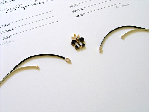
The bottom motif is a nod to the more complex design at the top and helps to balance the entire layout.
Once again I collaborated with Riva Brown of Wilmington, Delaware who did her usual impeccable calligraphy. Riva also handles the mounting and shipping of our documents.

