Quilled Tapis Series - Lisa Nilsson
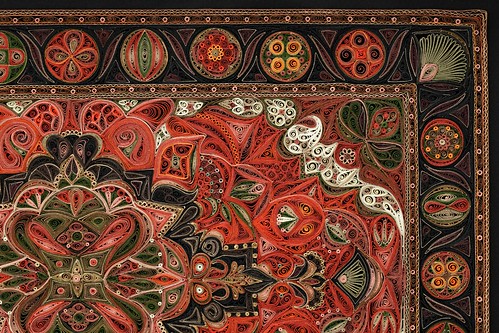
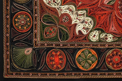
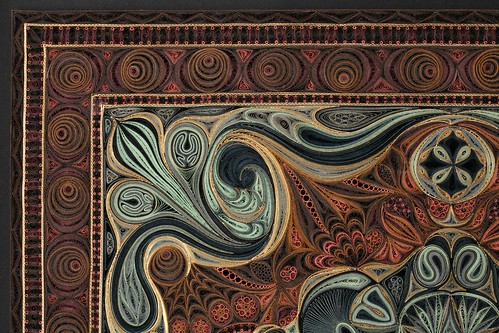
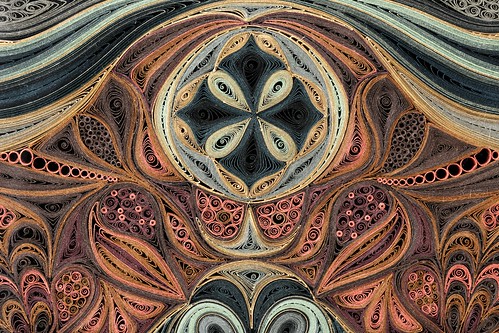
Lisa Nilsson's latest quillwork, Tapis Series, is incredibly detailed, almost to the point of making observers shake their heads in disbelief. You might recall her anatomical pieces, Tissue Series and Angelico, that similarly wowed the internet a couple of years ago. Lisa elevates quilling in a way that has never been seen in its hundreds of years as an art form via densely packed coils of quarter-inch mulberry strips, and crimped and shaped gilt paper, all of which she cuts by hand.
I asked Lisa to tell us about her inspiration for the new designs.
I felt I'd said most of what I'd like to say exploring anatomical
cross-sections in my Tissue Series and was ready to make a shift. I
had developed some interesting means of manipulating paper in service of
anatomical subject matter that I wanted more opportunity to explore, and
also to open up my available color palette from that present in bone,
muscle, viscera.
I was trying to find a level of structure that hit my sweet spot… not so much structure that I'd be bored from the outset (there have to be surprises), yet enough structure that I'm not paralyzed by too many decisions. My first attempt at a non-anatomical piece was to make a sort of syncopated grid sampler -- sort of a quilting approach. I thought this would provide the chance to try out different patterns and textures, but I found squaring up sections to be somewhat tedious and not what coiled paper naturally likes to do. I got bored after a few days of working on a piece that I estimated would take a couple of months to finish. I admitted that it was dead, a false start... back to the drawing board.
What drew me to rugs, and then to book bindings and other textiles is the use of the structure of a central medallion, field, corners and border. This has become my mantra, and I expect will keep me engaged and moving toward making an entire body of work over the next few years. This structure allows a good deal of freedom to explore shapes, textures and colors, and is a nice way to "break up the work into digestible chunks" as my husband advises when taking on lengthy tasks. Binding took several months to make and I had a good feeling of satisfaction when I completed the medallion, then the field etc. I start in the center and work out (quite different from the top-to-bottom, row-by-row manner of rug weaving).
Each piece is beautifully mounted. Tell us about the making of the frames and boxes... I imagine that is quite a detailed process also.
I employ tools and techniques from the worlds of book making, framing and woodworking. I start by making a wooden outer box of poplar and plywood, then cover it with book cloth using paste that book binders use. I also make a cherry or walnut inner box that has a groove cut in it to hold the glass. Inner box fits inside outer box; the two are held together by screws on the outer sides of the outer box.
Not so much. I love antique quilled pieces, though they differ from my work in the figure and ground relationship. The antique pieces I've looked at use a solid color paper or fabric background. The quilled elements are all positive figures and the paper or fabric serves as the negative space or ground. I like the quilling to do everything... I strive to make the negative shapes as interesting as the positive shapes and for them to fit together tightly, like the pieces of a puzzle. This builds some nice limitations into the process. When I'm considering a shape to make, both positive (figure) and negative (ground) must be interesting and fit together nicely, and also be doable in coils of paper.
When I worked at American Greetings, a fellow artist gave the following advice during a flower-painting workshop: "When you're stuck, make beautiful shapes." I love that... it does help when I'm stuck, and it's one of the things I enjoy about the medium of quilling. The shapes pinched coils make are inherently beautiful (tho' I somehow manage to make an ugly one from time to time).
Narrow rows of crimping were often seen in 18th century quilling but your rows appear especially fine.
Hmm, I don't know about the fineness... I use a commercially made crimping tool made of a couple of gears bolted to a block. I must admit it hurts my fingers to use, but gets the job done. I've seen photos of some gorgeous antique crimpers that have a handle to crank and would love to have one.
Did you use gold-edged paper in both pieces?
Yes, there is gilt paper in both... one of the trade-offs of not seeing glare from the glass in the photos is a diminution in the gleam of the gold. I used some old gilt paper (from old books) and some new (the old stuff is too brittle to crimp) that was made for me by a book binder in Chicago.
Thanks Lisa, I look forward to seeing your next piece in Tapis Series.
Lisa Nilsson is represented by Pavel Zoubok Fine Art in New York City.

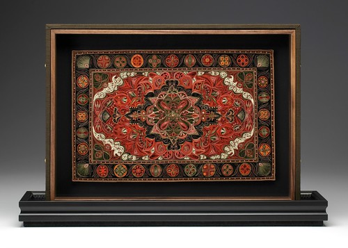
Small Red Rug
quilling dimensions: 9" x 12"
with box, base etc: 12" x 18"
I asked Lisa to tell us about her inspiration for the new designs.
I've been
calling this work Tapis Series - tapis being French for rug or
carpet. I first encountered the word in a song referring to a "tapis
de verdure" or "carpet of greenery" on the ground and liked the blending
of natural and man-made in the phrase.
I was trying to find a level of structure that hit my sweet spot… not so much structure that I'd be bored from the outset (there have to be surprises), yet enough structure that I'm not paralyzed by too many decisions. My first attempt at a non-anatomical piece was to make a sort of syncopated grid sampler -- sort of a quilting approach. I thought this would provide the chance to try out different patterns and textures, but I found squaring up sections to be somewhat tedious and not what coiled paper naturally likes to do. I got bored after a few days of working on a piece that I estimated would take a couple of months to finish. I admitted that it was dead, a false start... back to the drawing board.
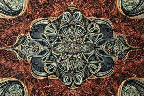
What drew me to rugs, and then to book bindings and other textiles is the use of the structure of a central medallion, field, corners and border. This has become my mantra, and I expect will keep me engaged and moving toward making an entire body of work over the next few years. This structure allows a good deal of freedom to explore shapes, textures and colors, and is a nice way to "break up the work into digestible chunks" as my husband advises when taking on lengthy tasks. Binding took several months to make and I had a good feeling of satisfaction when I completed the medallion, then the field etc. I start in the center and work out (quite different from the top-to-bottom, row-by-row manner of rug weaving).
It's hard to go wrong with bilateral symmetry. We humans seem to
like it. And I find it relaxing to make four of things - fewer
decisions. Also, there is a built-in wonkiness. By the time I've made
the third and fourth versions of an element, I've gotten better at it
and they appear more mature and developed than the first two. Taking
my cue from rugs I've loved, I see that there is a good deal of
irregularity in what first appears as highly-precise detail. I love
this, but wouldn't do it deliberately. I like that it is a desired
side-effect of the process.
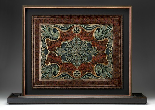
Binding
quilling dimensions: 17" x 20"
with box, base etc: 22" x 30"
Each piece is beautifully mounted. Tell us about the making of the frames and boxes... I imagine that is quite a detailed process also.
I employ tools and techniques from the worlds of book making, framing and woodworking. I start by making a wooden outer box of poplar and plywood, then cover it with book cloth using paste that book binders use. I also make a cherry or walnut inner box that has a groove cut in it to hold the glass. Inner box fits inside outer box; the two are held together by screws on the outer sides of the outer box.
For
the base, I use picture frame molding. I cut a block from dense wood
(oak) that fits the void in the picture frame. I screw the outer
box into the block, then the whole thing is stabilized and held together by
a piece of medium density fibreboard screwed to the bottom of the base. I cover the bottom of the fibreboard with wool felt… it looks cool and protects the surface (furniture) that the piece may be placed on.
So
far, this is the simplest approach I've found to get what I want - a
stand-up presentation, the look of the combination of wood and book
cloth, and the whole thing can be taken apart by unscrewing to access
the artwork, should it ever require restoration. The artwork is glued
to a board (book binder's board covered with black paper) but not to the
box.
Did you look to antique quillwork for inspiration?
Did you look to antique quillwork for inspiration?
Not so much. I love antique quilled pieces, though they differ from my work in the figure and ground relationship. The antique pieces I've looked at use a solid color paper or fabric background. The quilled elements are all positive figures and the paper or fabric serves as the negative space or ground. I like the quilling to do everything... I strive to make the negative shapes as interesting as the positive shapes and for them to fit together tightly, like the pieces of a puzzle. This builds some nice limitations into the process. When I'm considering a shape to make, both positive (figure) and negative (ground) must be interesting and fit together nicely, and also be doable in coils of paper.
When I worked at American Greetings, a fellow artist gave the following advice during a flower-painting workshop: "When you're stuck, make beautiful shapes." I love that... it does help when I'm stuck, and it's one of the things I enjoy about the medium of quilling. The shapes pinched coils make are inherently beautiful (tho' I somehow manage to make an ugly one from time to time).
Narrow rows of crimping were often seen in 18th century quilling but your rows appear especially fine.
Hmm, I don't know about the fineness... I use a commercially made crimping tool made of a couple of gears bolted to a block. I must admit it hurts my fingers to use, but gets the job done. I've seen photos of some gorgeous antique crimpers that have a handle to crank and would love to have one.
Did you use gold-edged paper in both pieces?
Yes, there is gilt paper in both... one of the trade-offs of not seeing glare from the glass in the photos is a diminution in the gleam of the gold. I used some old gilt paper (from old books) and some new (the old stuff is too brittle to crimp) that was made for me by a book binder in Chicago.
Thanks Lisa, I look forward to seeing your next piece in Tapis Series.
Lisa Nilsson is represented by Pavel Zoubok Fine Art in New York City.

