Latest Quillwork from PaperGraphic
You might recall the fabulous PaperGraphic quilling of Natasha Molotkova from a couple of posts here and here earlier in the year. We've stayed in touch and recently I was delighted to see images of Natasha's latest work. She has been busy creating quilled designs for advertising agencies and has also updated her website [no longer available] with a new design and gallery.
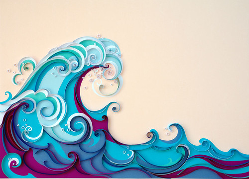
Natasha does water scenes beautifully... after posting this quilled boat on her site, she received quite a few work offers based on the sun, sea, and waves. Every coil and curved strip of Natasha's quilling serves a purpose and is distinct - a steady hand for sure!
This design was for an article in Acquirer Magazine.
They liked it so much that she was given a rare on-page acknowledgment.
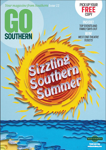
Sizzling Southern Summer was a cover design for a railway company magazine. That sun looks HOT!
Natasha quills only by hand, not digitally. She first sketched the design 'Enabling the Bio Economy' for European Paper Week 2012's convention from a brief she was given by the Persua advertising firm in Belgium. After completing the quilling, she mailed it to Persua to be photographed.
Sometimes ad agencies accept high resolution images of her work, but others prefer to photograph it in studio. She generally uses cardstock rather than true quilling paper, glues on-edge strips along their entire length so the design stays in place during transit, and carefully packs her work in bubble wrap inside a plastic box so it arrives in perfect condition.
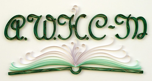
Pretty Please is a website logo she designed, and the Ex Libris bookplate was quilled for a friend.
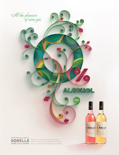
This is an advertising graphic she quilled for Sorelle Wine's new 0% alcohol wine.
Natasha Molotkova can be contacted via her website PaperGraphic [site is no longer available].


